Here’s some notes about anti-aliased lines.
For these tests of rendering anti-aliased lines my goals were roughly as follows:
- relatively high-quality anti-aliased lines (better than subsampling or postprocessing)
- simple low-tech solution extendable to wide range of platforms (e.g. not relying on availability of shaders)
- visually better consistency than what you get if you just ask graphics API to anti-alias lines for you, and you might not even get any if the hardware is lacking
- try to solve issue of anti-aliased lines showing a “roping” effect
- concentrate on case of single lines without yet going to additional complexities such as line caps or joins between multiple lines
I set to test out stuff with Processing, and decided first to do a comparison of what anti-aliased lines look by default in it. Here’s an animation showing my simple test pattern with P2D, P3D and JAVA2D renderers:
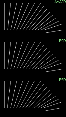
As you can see, the results vary a bit, which is no surprise since those different renderers surely have differing precision/performance goals or just a different way to render the lines. For lines close to perfectly horizontal/vertical lines they’re pretty similar, showing clearly the “roping” effect I mentioned above. For lines close to 45 degree angles the JAVA2D renderer seems to look a bit better.
So, to move forward, here’s a magnified illustration of the technique how I’m drawing lines using two quads having a gradient going from 100% in center to 0% towards edge. In actual rendering that gradient ramp is done in alpha channel, but for these example images I’m using green background and a ramp from white to black to show more clearly what’s being done.
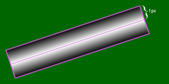
I’m basically just building on top of somebody else’s basic idea about how to render hardware accelerated lines by constructing polygons with gradient fins yourself instead of using a call to draw line primitives. I don’t know whose idea this is originally, having heard this a few times from different sources, but to fully research this subject you’d need to go back 30 years or so (check the short list of related links at end of this post).
When you use this technique to draw a line with “1 pix” thickness (although the fins cover total of 2 pixels), it yields pretty identical result with what you see in the above examples from Processing’s P2D/P3D/JAVA2D renderers. Well, not quite – for some reason, it actually depends a bit on the hardware. On low-end Intel GMA950 that statement of looking the same holds true. When I try that on my desktop PC with nVidia video card, the lines actually look much better (slightly fatter but without the roping). I found this out only later though, since I did all of my initial tests about this on a mini laptop which has the GMA950. :)
When the roping issue of anti-aliased lines is discussed, I have noticed that often somebody knowledgeable enough says it’s actually a gamma issue. The problem here being of course the fact that there are many ways to tackle the gamma thing, where none of them are a silver bullet solution which wouldn’t bring a host of other problems with it.
I got the idea that I could modify the above technique to draw two 0.5 unit wide fins per side, and apply gamma correction at the halfway. This would be still very simple and low-tech way to draw gamma corrected lines.
So here’s an illustration of what’s modified compared to the previous example:
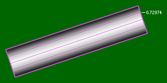
The magic value of 0.72974 comes from 0.5^(1/2.2), assuming that your display gamma is 2.2. I also tried 0.707107 which comes from 0.5^(1/2), which is equal to sqrt(0.5), i.e. a good approximation which is “close enough” if you want to simplify the equation. Here is an animation showing the differences with no gamma correction, and then gamma correction with values of 2 and 2.2:
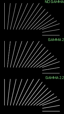
As I said above, the “no gamma” case looks very close to the gamma corrected one on different hardware, but the gamma 2.2 corrected case looks identical on the few machines I tried this on. I’m not sure what’s going on with that, hopefully somebody can explain it to me. I don’t have any explicitly enabled “gamma correction” features from drivers.
A few observations from the images. With the above technique even the perfectly horizontal and vertical lines get a small halo to nearby pixels. What’s good though is that the perceived brightness stays same very well regardless of line angle.
Perhaps one of the most annoying side effects of this technique is the fact that now the lines look fatter than normal 1 pix wide lines. I have done a few tests of reducing the fin width and/or decreasing the brightness. You can’t reduce the fin width much without the result quickly getting ugly, but decreasing just the brightness doesn’t really make the line look much thinner, it looks just darker. I don’t know what would be the optimal way, but I think maybe it involves a combination of both to some extent. Here’s one test image where I have reduced the fin width slightly as well as the brightness:
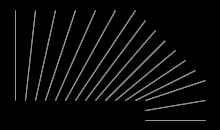
I think a bit of the roping effect has crawled back in, but the perceived brightness between angles is pretty much ok.
Here’s test code, runnable inside Processing. What’s additionally not visible in the example images above is the fact that the default renderers clamp coordinates to integers, while this method allows you to draw lines with perfect sub-pixel precision. The test code is modified to offset the lines by time slowly so you can see that in action. If you want to try the regular lines reference test case, replace the renderer in initial size() call to P2D/P3D/JAVA2D, and replace the call to testAALines(…) in draw() with the commented call to testLines(…).
Related links:
- Anti-Aliasing Through the Use of Coordinate Transformations (K. Turkowski, 1982).
- Prefiltered Antialiased Lines Using Half-Plane Distance Functions
- GPU Gems 2 chapter 22: Fast Prefiltered Lines
- OpenGL Invariance: Texture AA (with glAArg library)
Additional credits/thanks: I think I learned first time about using simple gradient instead of other tricks (like textures) from Mikko Mononen. Raigan Burns noted that the line being a bit fat and “bleeding” into adjacent pixels is actually a feature, since that way the lines actually look a lot better in motion. Alex May told me that most of Eufloria game’s drawing works like this, except for using texture for drawing the lines and having a bunch of textures with different gradients to get different visuals. The gradients are circular and lines are drawn using a cross section of the texture, with rest of the texture used to make caps for round-ended lines.
The fin triangles concept also appears much earlier in Eric Chan’s article: Fast Antialiasing Using Prefiltered Lines on Graphics Hardware.